Our LGBTQ+ Pride Apparel Brand Story
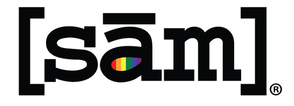
Our LGBTQ+ logo, designed back in 2005, aimed to represent the gay community and those who love and support them. Rather than create just another ordinary logo for lesbian and gay clothing, I wanted it to be more than that, a brand that resonated with meaning. As a lesbian navigating the dating scene in the 90s, it was a different time, and many people weren't as open about their identities as they are today. We didn't have dating apps or strong community support like we do now. Flirting with someone carried a certain level of risk unless you were absolutely certain of their sexual orientation. Unless you possessed a crystal ball and had an uncanny ability to read minds, identifying queer people wasn't so easy. I used to joke with my friends, saying, "Wouldn't it be fantastic if we could just spot the gays with a single glance?" So, what began as a lighthearted remark morphed into our present-day [sām] logo. The logo itself is a clever play on the word "same," pronounced phonetically, and represents "same sex." It serves as a subtle yet attention-grabbing statement, proudly proclaiming, "Yes, I am gay!"
While the logo's origins lie in representing one's sexual orientation, it has since evolved into much more than a mere proclamation of being gay. The logo has grown beyond its initial purpose. It's now a powerful symbol that declares, "Yes, I'm part of the LGBTQ+ community, but at the end of the day, I'm just like everyone else." It's a reminder that we all experience love, pain, and the pursuit of happiness, regardless of who we are. As society progresses, we'll come to understand that our similarities far outweigh our differences.
Come join us in propelling this movement forward.
With pride,
Deb, Founder of Same Apparel
